Company
Improved data clarity and workflow efficiency across production, pricing, and scheduling.
Product Designer
Duration
Sept 2025 - Dec 2025
Team
1 Product Manager · 3 Developers · Product Leadership (Direction)
Enterprise ERP Redesign
Redesigned a legacy ERP to modernize operations for a high-volume apparel manufacturer. After auditing the existing MS Access–based system, I mapped pain points across production, inventory, billing, and order flow. Using rapid prototyping and iterative reviews, I redesigned modules to improve clarity, reduce errors, and streamline daily workflows.
The updated system introduced clearer hierarchy, simplified task flow, unified data structures, and scalable components — giving Cowichan a more reliable and efficient operational backbone.

The "UX" Problem
The legacy system was confusing and inconsistent, with weak information architecture and limited automation, so only one expert could reliably use it, creating a major bottleneck and scaling risk.
The "Real World" Problem
The one person who knew the system was going on maternity leave, and no one else could confidently place orders or be trained quickly.
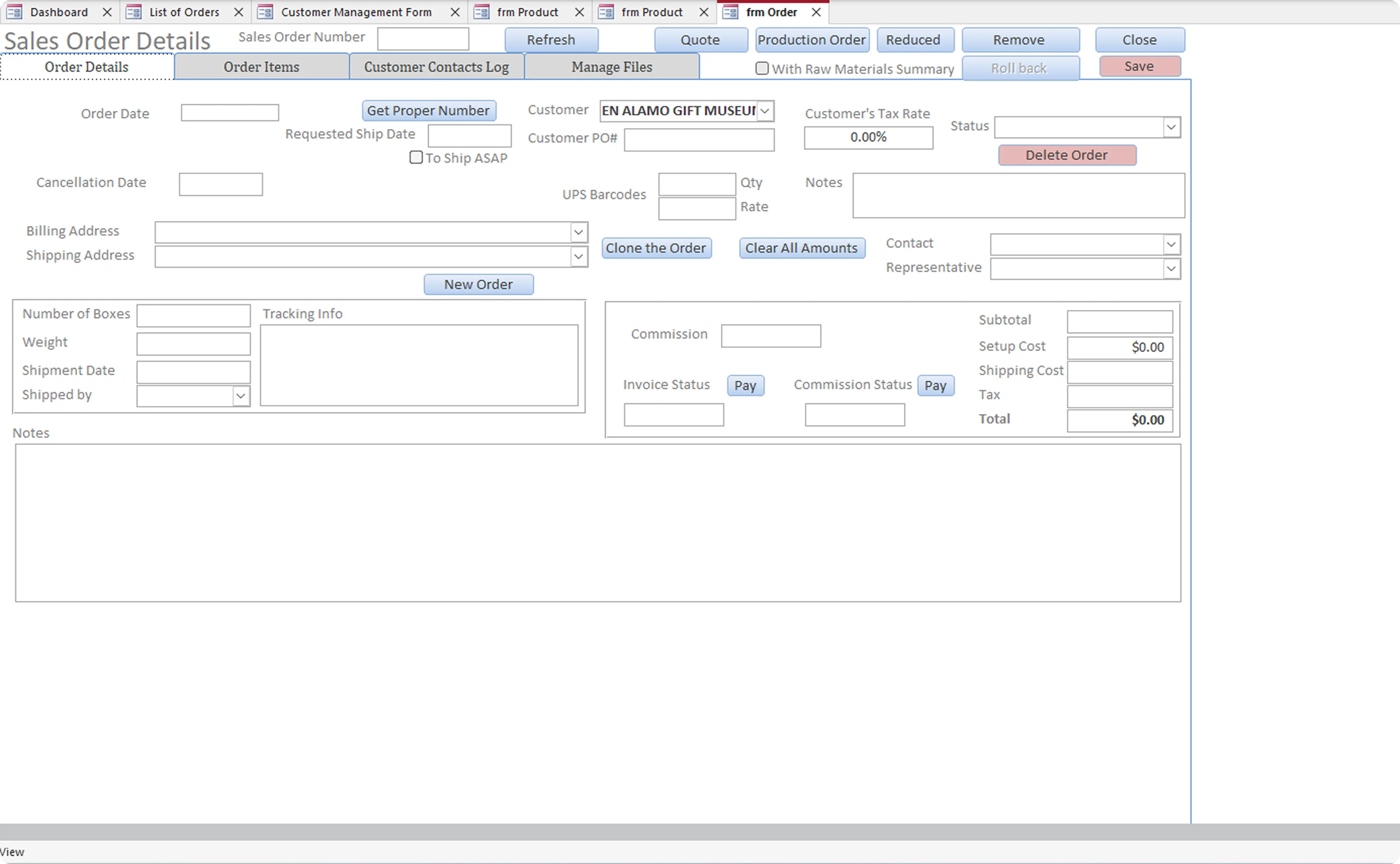
Before Redesign
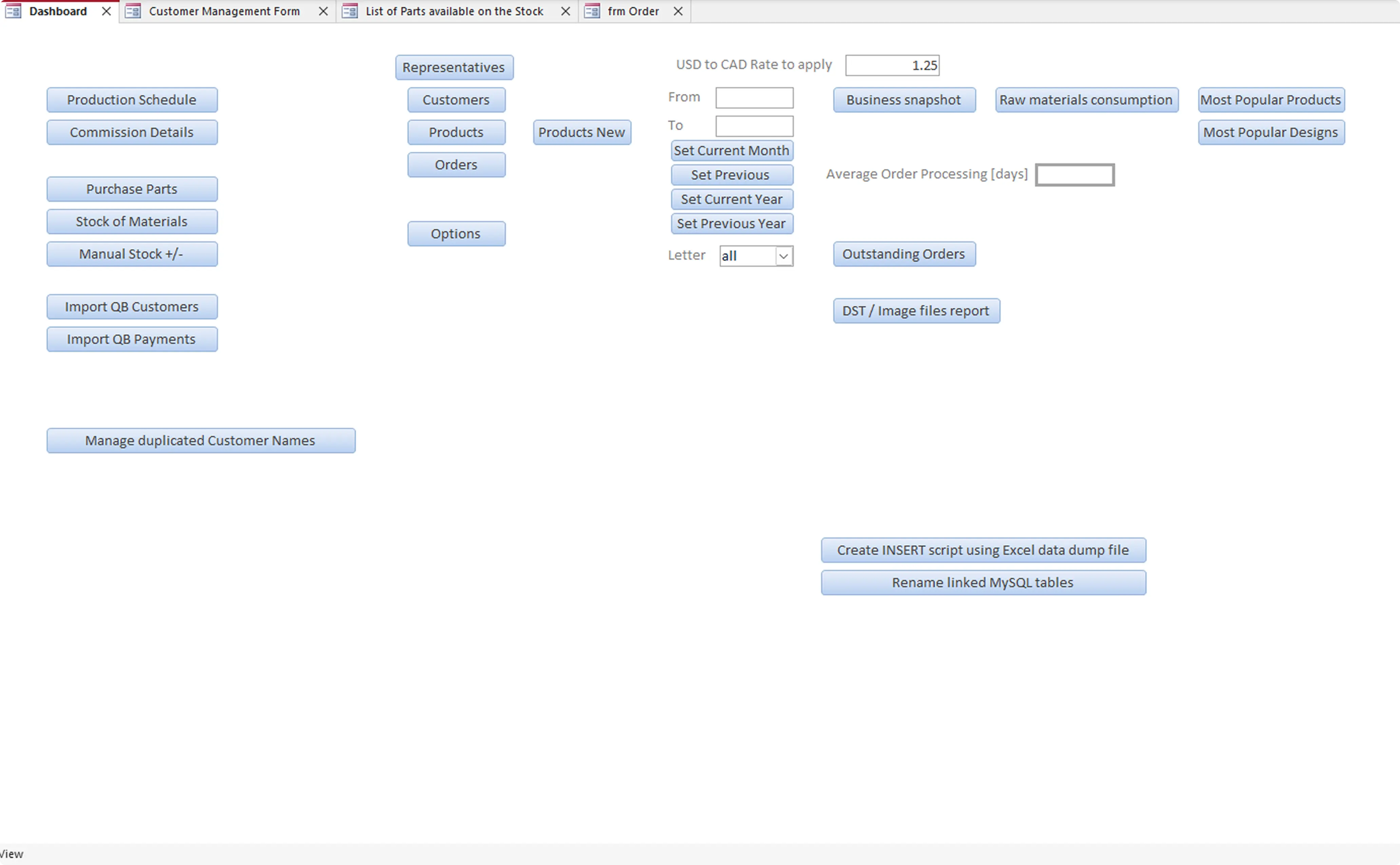
Dashboard
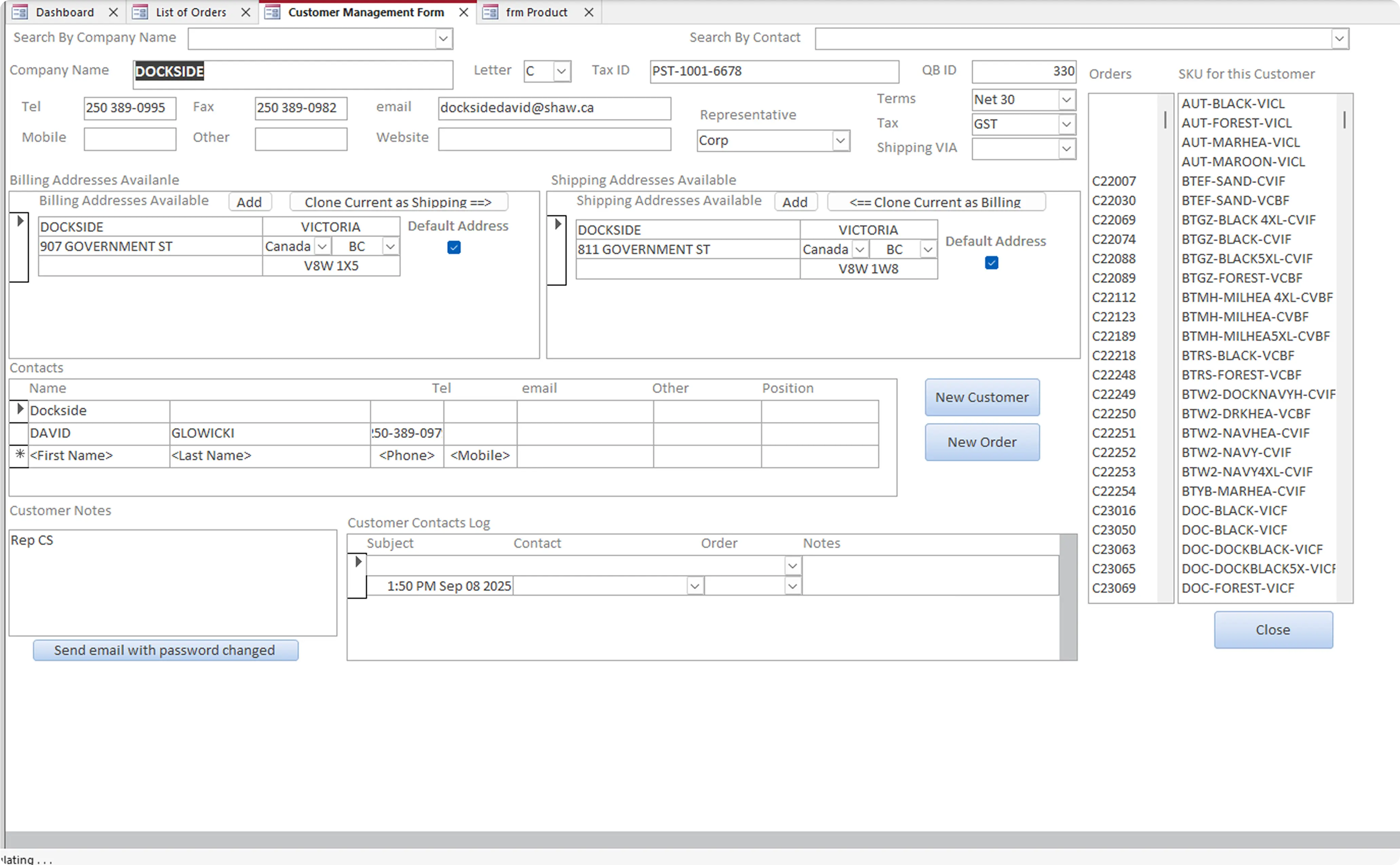
Customer View
New Order
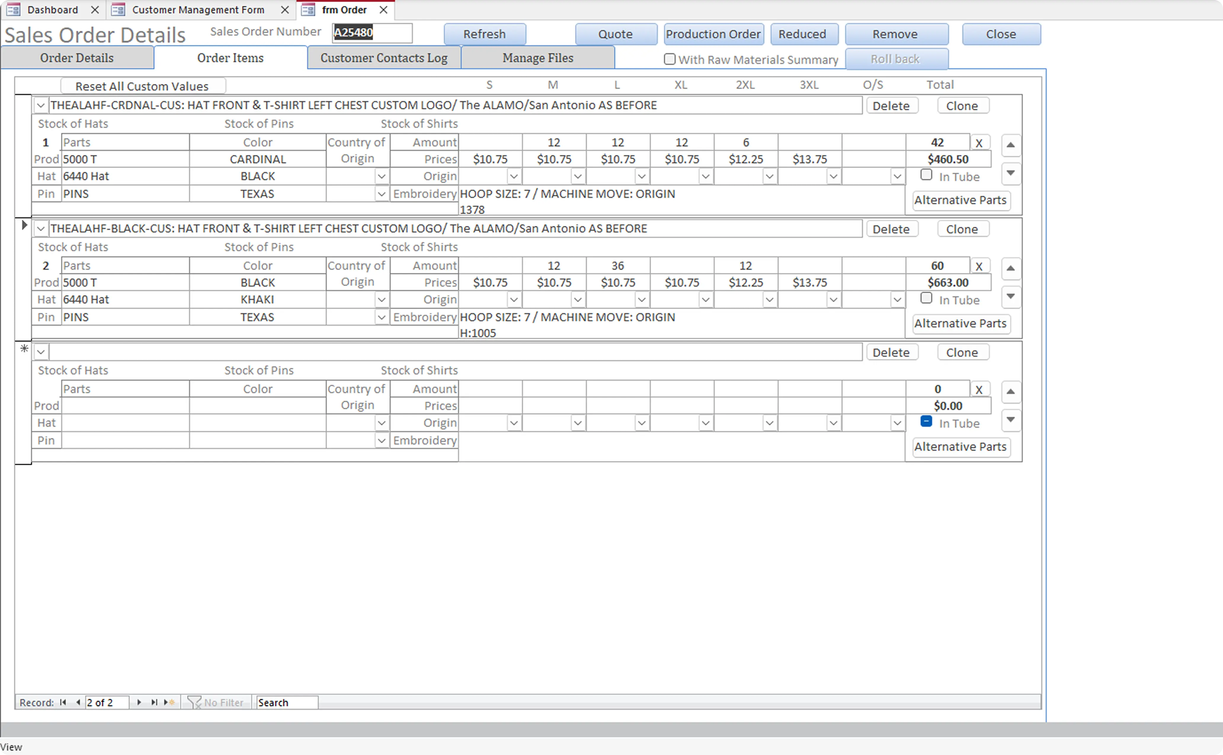
Order Details
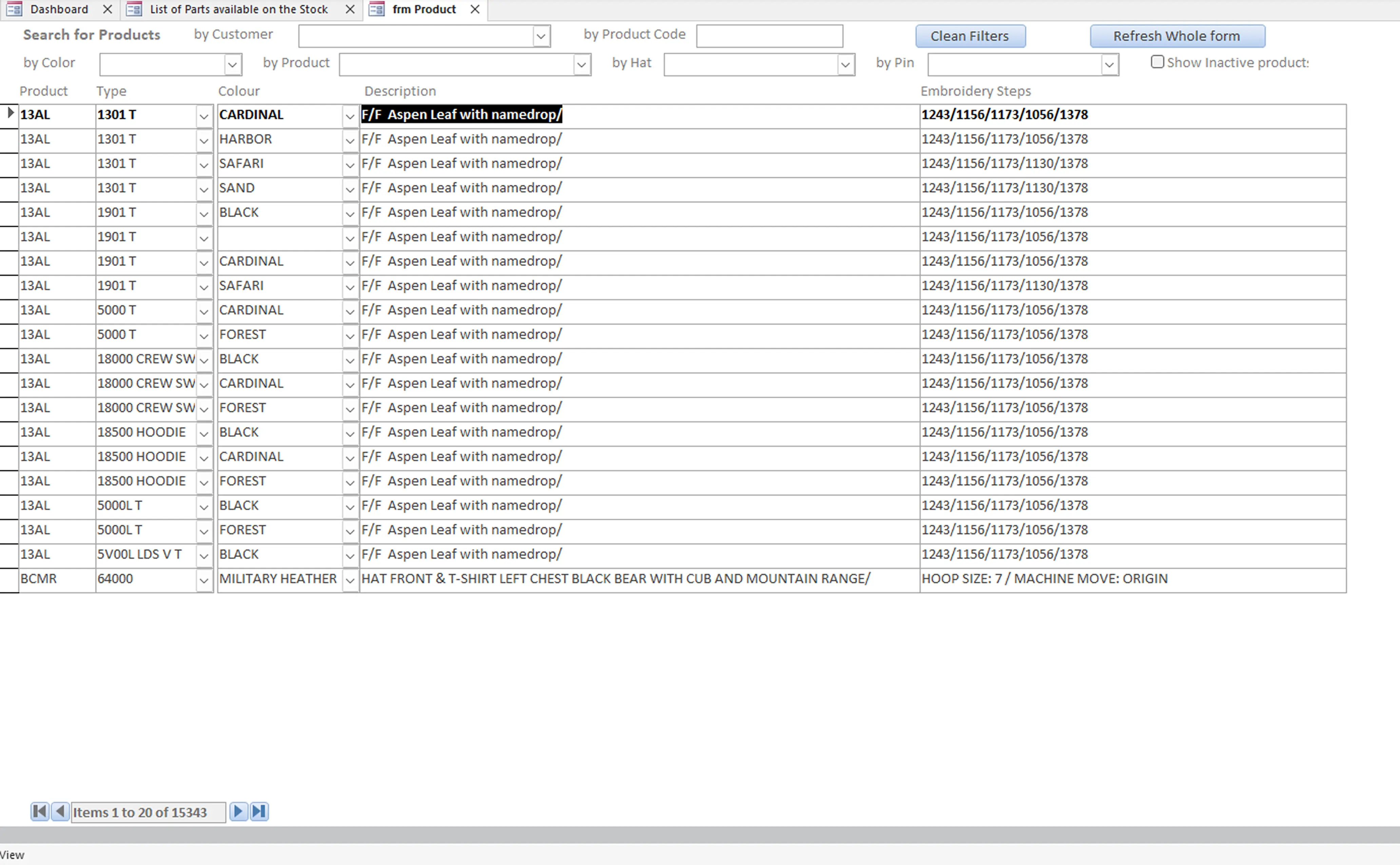
Product List
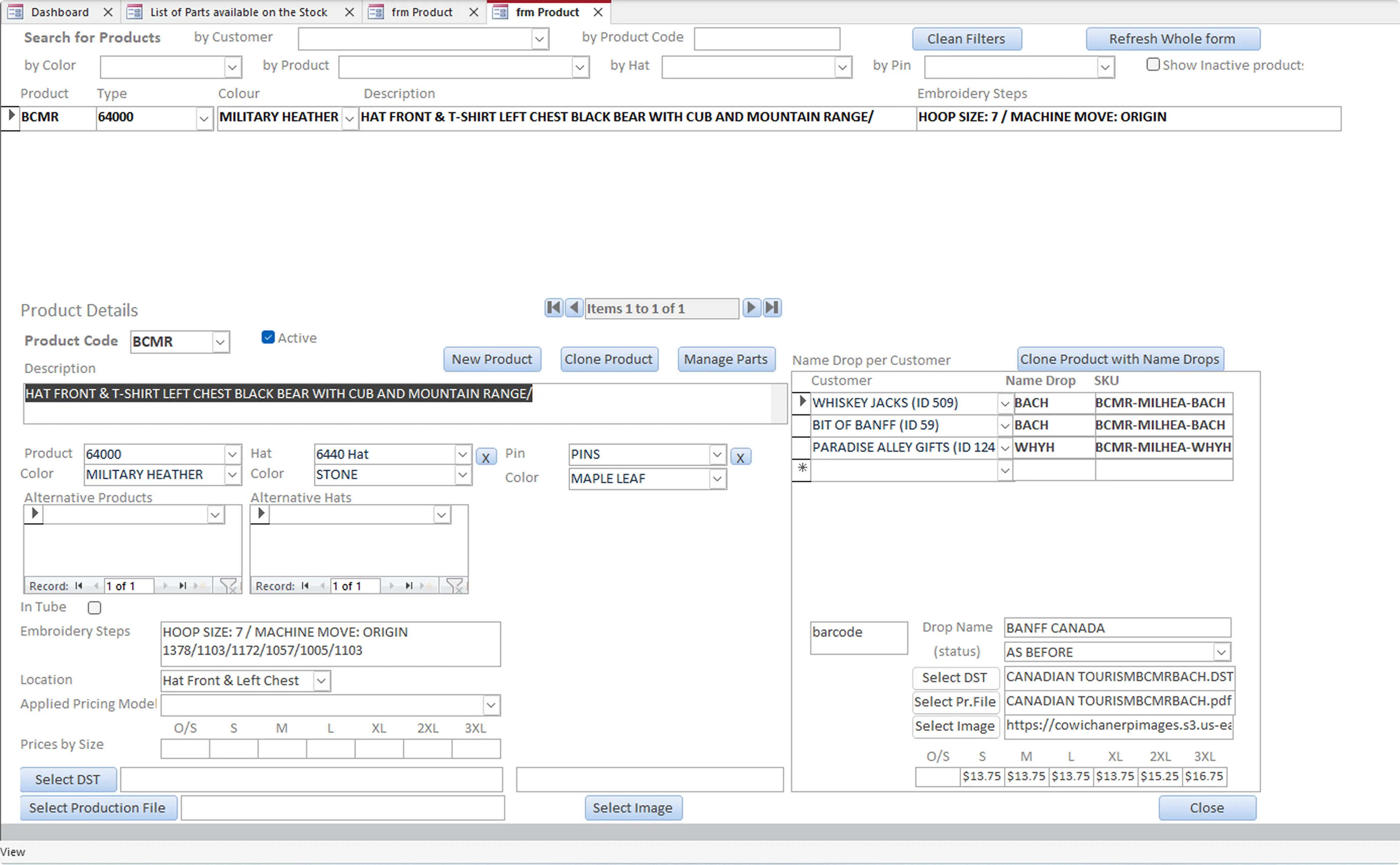
Product Detail
Goal
Redesign the ERP so it could be used confidently by anyone, support growth, and reduce operational risk.
System Level Issues
Clarity
No clear information hierarchy, every screen felt different
Familiarity
Workflows depended on memory, not guidance
Efficiency
New users had no clear starting point
Trust
Small mistakes had big downstream impact
Design Approach
After gaining a clear understanding of how ERP was used
Design Approach
After gaining a clear understanding of how Endobits was used in clinics
I worked closely with our Product Manager (also the CTO), CEO, Operations Manager, and Chief Medical Officer to define a new direction for the product.
Through this collaboration, we aligned around four guiding principles that shaped the redesign. These principles helped balance clinical precision with everyday usability — ensuring that the new Endobits experience felt both professional and familiar to clinicians.
Dashboard Redesign
Establishing clarity, consistency, and a new design direction
Transforming a dense clinical dashboard into a modern, consumer-grade experience
To fix inconsistencies and improve readability, I began by defining a lightweight design system. This helped expose issues with the existing dashboard and guided the redesign toward a more intuitive and clinically confident experience.

Old dashboard layout + patient card close-up + early design system foundations
Exploration & Design Evolution
From incremental improvements to consumer-inspired interaction models
I refined the existing dashboard first, improving spacing and simplifying filters. Then I explored card-based layouts inspired by streaming platforms, which helped clinicians scan patient data faster and more intuitively.

Early structural refinements and consumer-inspired layout explorations
Final Dashboard UI
A modern clinical dashboard designed for speed and confidence
The final design uses large, glanceable cards with clear risk indicators and hover details. Patients are grouped into meaningful categories, helping clinicians triage faster and stay focused on what matters most.

Final dashboard redesign featuring large, glanceable cards, cleaner hierarchy, hover-based insight reveals, and a full system of card variants built for clinical workflows such as triage, setup checks, and reviewing last-seen patients.
Patient Charts Redesign
Understanding the challenges of the original Patient Charts
Making complex glucose trends clearer and easier to interpret
The original charts view surfaced valuable data but lacked structure and hierarchy, forcing clinicians to scan multiple dense graphs to find key insights. This made it difficult to quickly understand glucose patterns, variability, and daily trends.

Original charts view: exposure summaries, trend graphs, and raw data tables presented without clear hierarchy.
Exploration & Design Evolution
From dense trend charts to clearer, clinically meaningful insights
I refined the existing charts first by improving spacing, simplifying labels, and restructuring how trends were presented. Then I explored layouts that grouped related insights together — exposure, daily trends, historical comparison — making it easier for clinicians to understand glucose patterns at a glance.

Early structural refinements of trend charts, exposure summaries, and historical comparison views.
Final Patient Charts UI
A redesigned clinical analytics view that improves insight delivery and decision-making.
The updated charts view presents time-series data, trends, and insights in a cleaner, more interpretable layout.
Large charts, tighter spacing, and clearer visual hierarchy make it easier for clinicians to identify patterns, compare metrics, and review patient progress.

Final redesigned charts view with improved trends, insights, and clinical readability.
Additional Design Work
Designed and built the product & corporate site in Framer, creating a cleaner brand presence and improving clinic onboarding clarity. (The orange labels are live links to the websites)
Presentation Decks
Created pitch, investor, and clinical education decks, establishing consistent visual language across teams.

Marketing & Print Assets
Designed brochures, email signatures, business cards, and clinic posters to support product rollout.

Designed brochures, posters, email updates, business cards, and event collateral to support product launches and clinic engagement.
Business & User Impact
Anyone Could Use the System
The ERP no longer depended on a single expert, any team member could understand and operate it confidently.
Fewer Errors, Faster Orders
Clear structure and visual context reduced errors by ~50% and cut order entry time by 25–50%.
Smarter
Business Decisions
Smart tags and suggestions enabled faster reuse of designs and supported upsell opportunities across regions.
Stronger Customer Relationships
Shared customer context turned transactions into trusted conversations.
Reflection
What Worked
Fast, continuous feedback loops
Strong collaboration with PMs and engineers
A design system enabled scalable handoff
What I'd Improve
More structured upfront discovery
Additional validation after development launch
More time for visual refinement
I’m actively adding this case study, check back shortly.
DISCOVER MORE


